Woofwise App
Product Design
Product Design
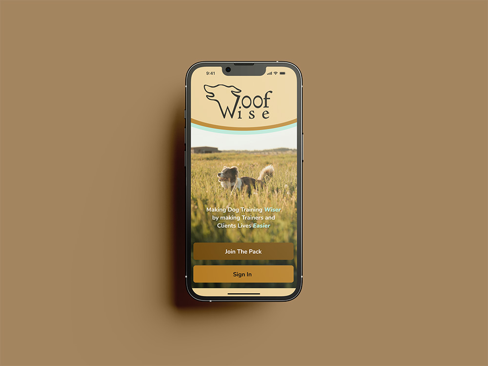
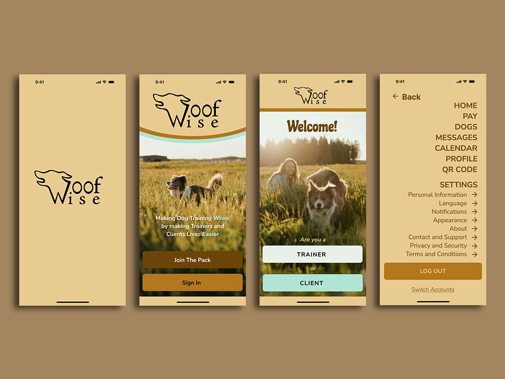
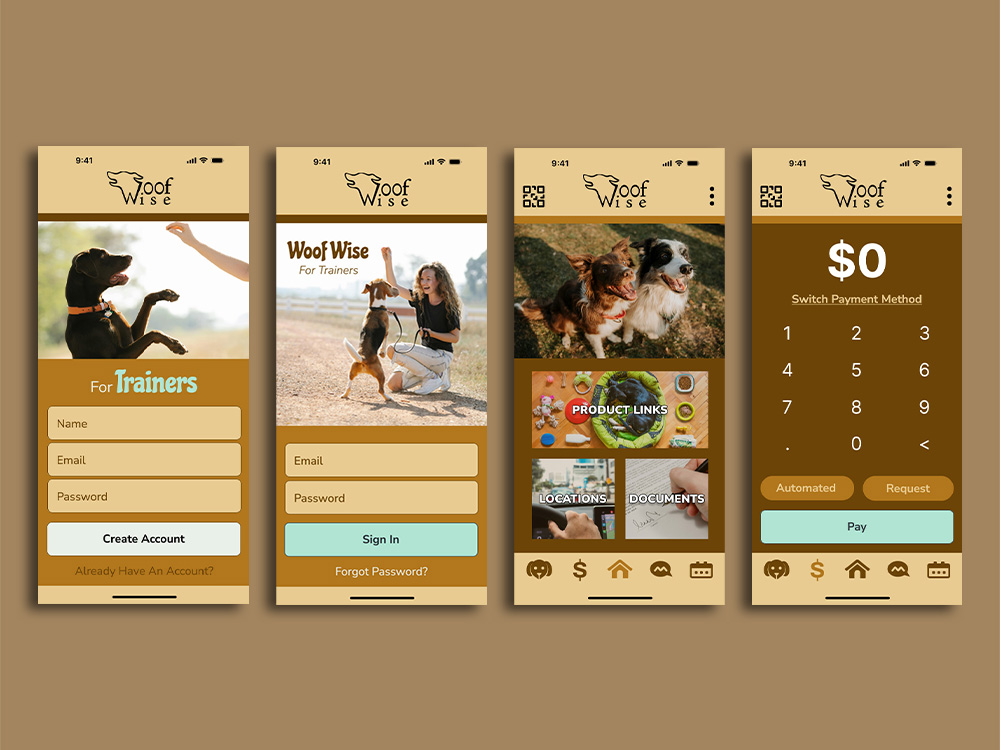
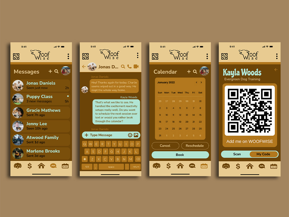
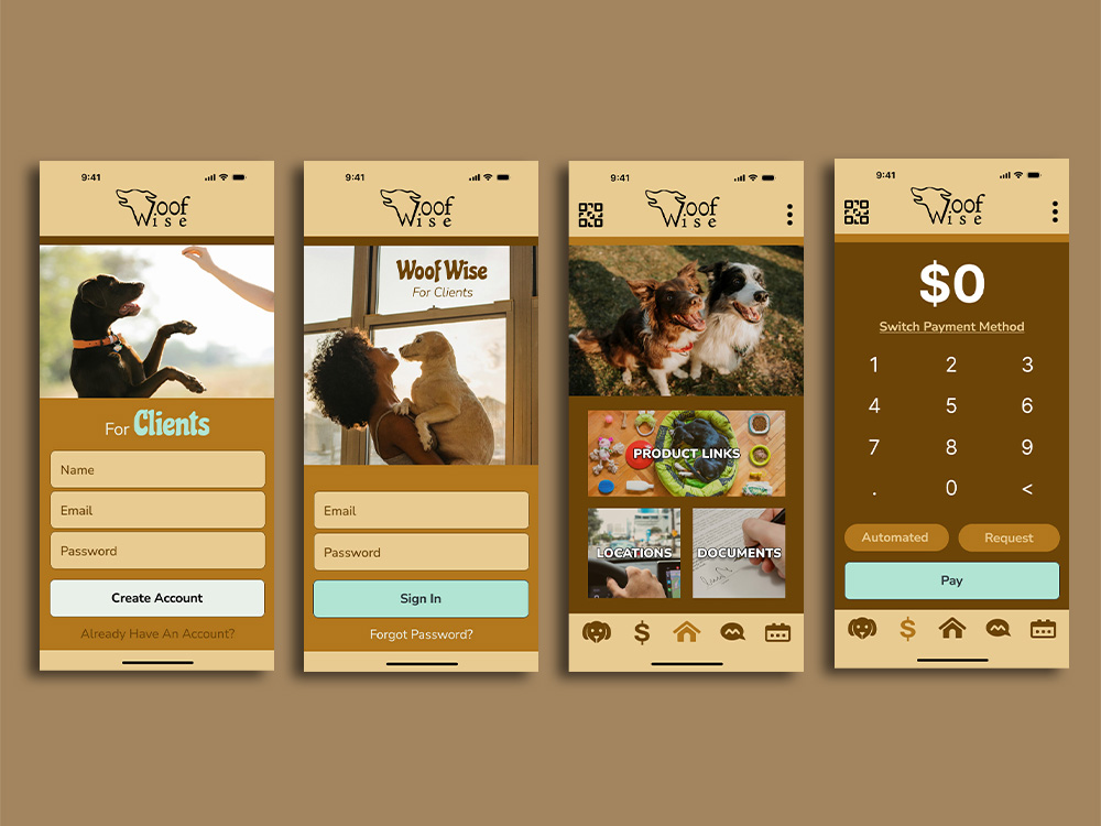
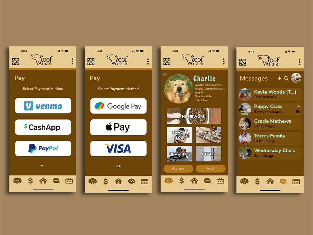
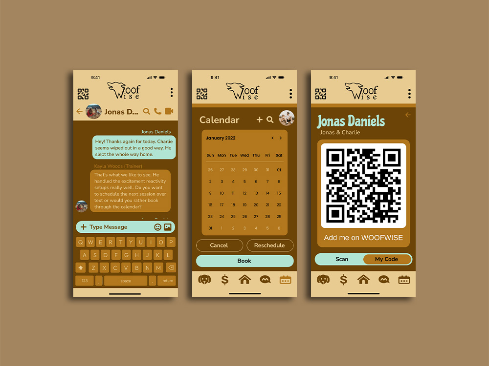
Woofwise is an all-in-one dog training app that connects trainers and clients through a streamlined dual-interface platform designed to simplify and centralize the entire training process from start to finish.
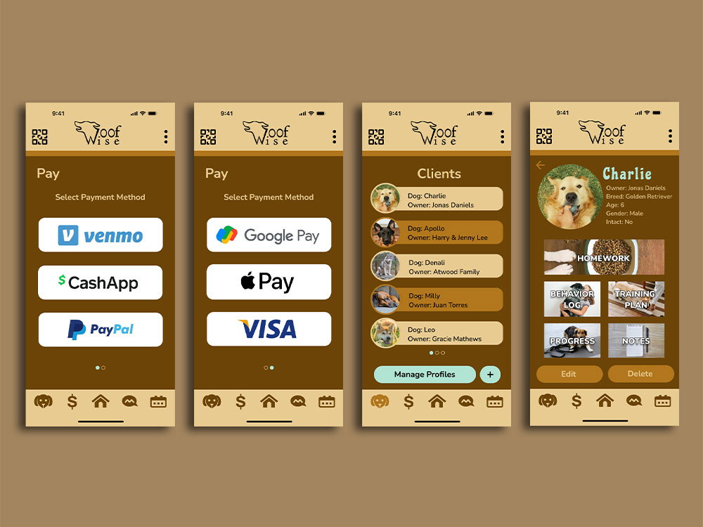
Trainers can share personalized content, build structured training plans, and manage client progress over time, allowing them to deliver consistent, tailored guidance to each dog while staying organized across multiple clients. Clients, in turn, follow a clear, trainer-guided experience that is customized to their dog’s specific needs, behaviors, and training goals, helping them stay on track with confidence and structure. This creates a more consistent and supportive training environment outside of in-person sessions.
With features like scheduling, messaging, in-app payments, dog profiles, and a customizable home page, Woofwise keeps everything organized in one intuitive space. It helps strengthen communication between trainers and owners while making training more accessible, efficient, and easy to maintain day to day.
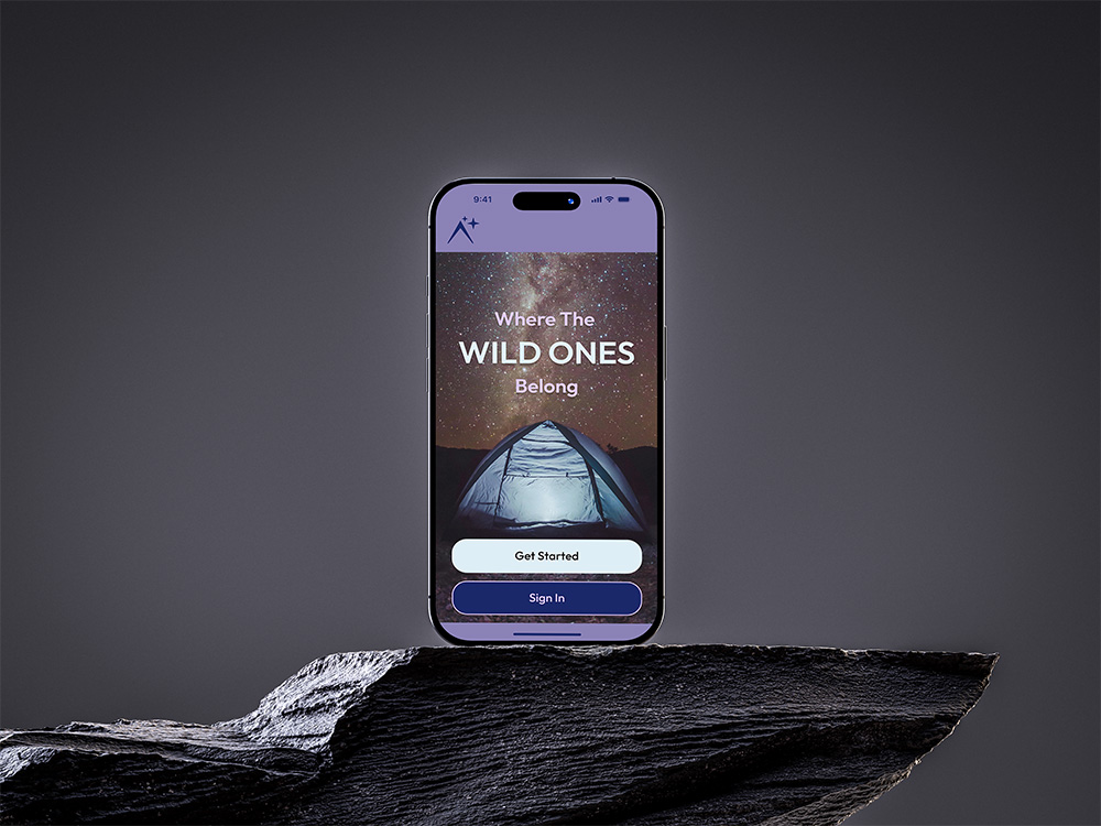
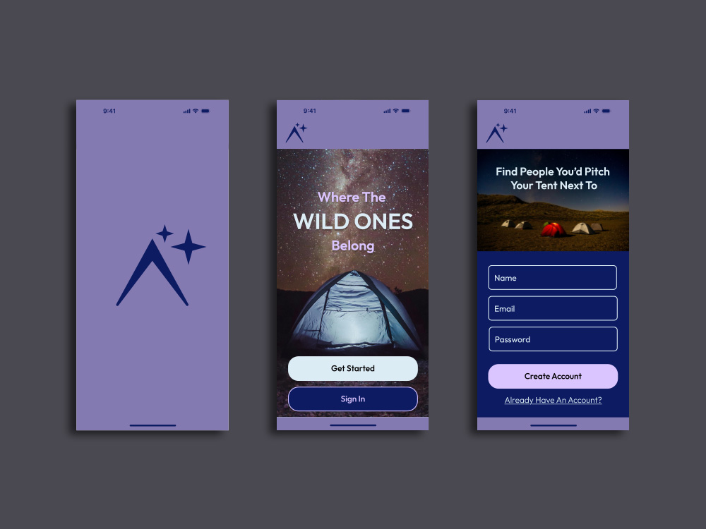
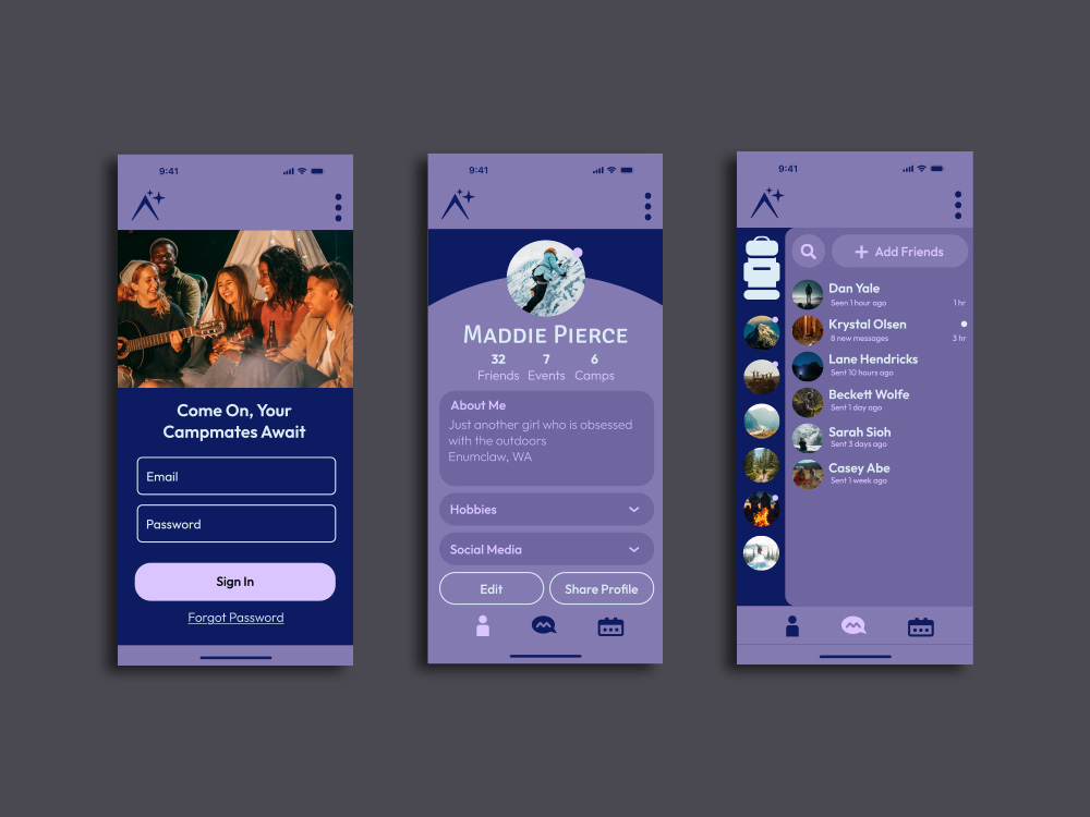
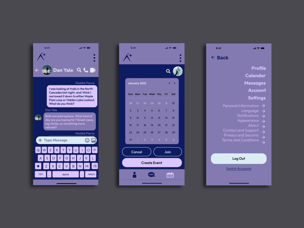
Base Camp is an outdoor community app that connects users through large-scale servers, organized channels, and structured social spaces designed to support everything from small groups to clubs, organizations, and expansive outdoor communities.
It features private and group chats that allow users to communicate both casually and within focused interest groups, including robust server environments built to support coordination across large communities and complex group structures. An integrated event scheduling system with a shared calendar helps organize meetups, trips, and group activities, while keeping everyone aligned in one centralized place. Customizable profiles let users express themselves through bios, photos, social links, and hobby tags, making it easier to connect with others who share similar interests and outdoor goals.
Designed to balance connection and calm, Base Camp brings communication, organization, and shared passions together in one intuitive platform that supports both everyday interaction and large-scale community coordination.
Product Design
Product Design
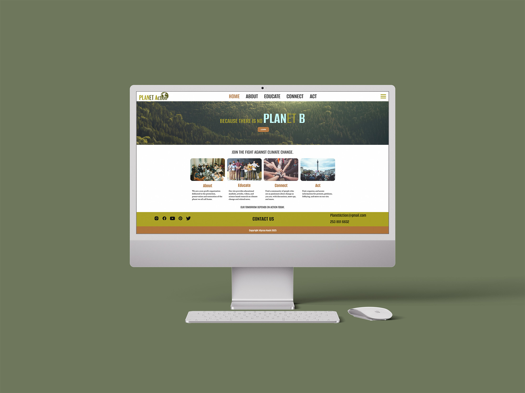
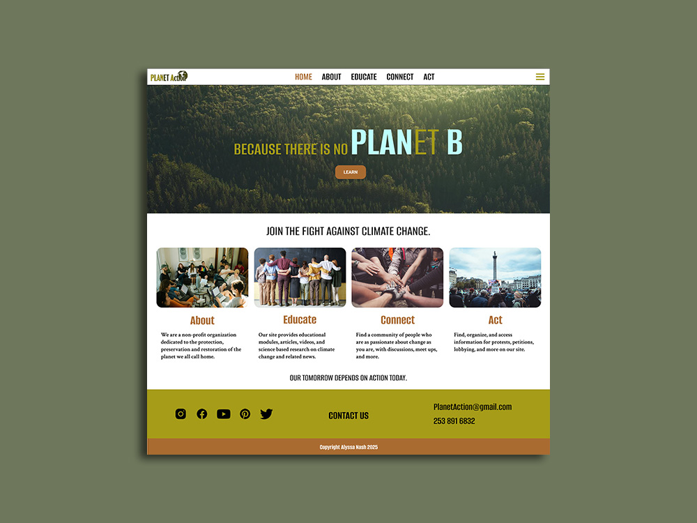
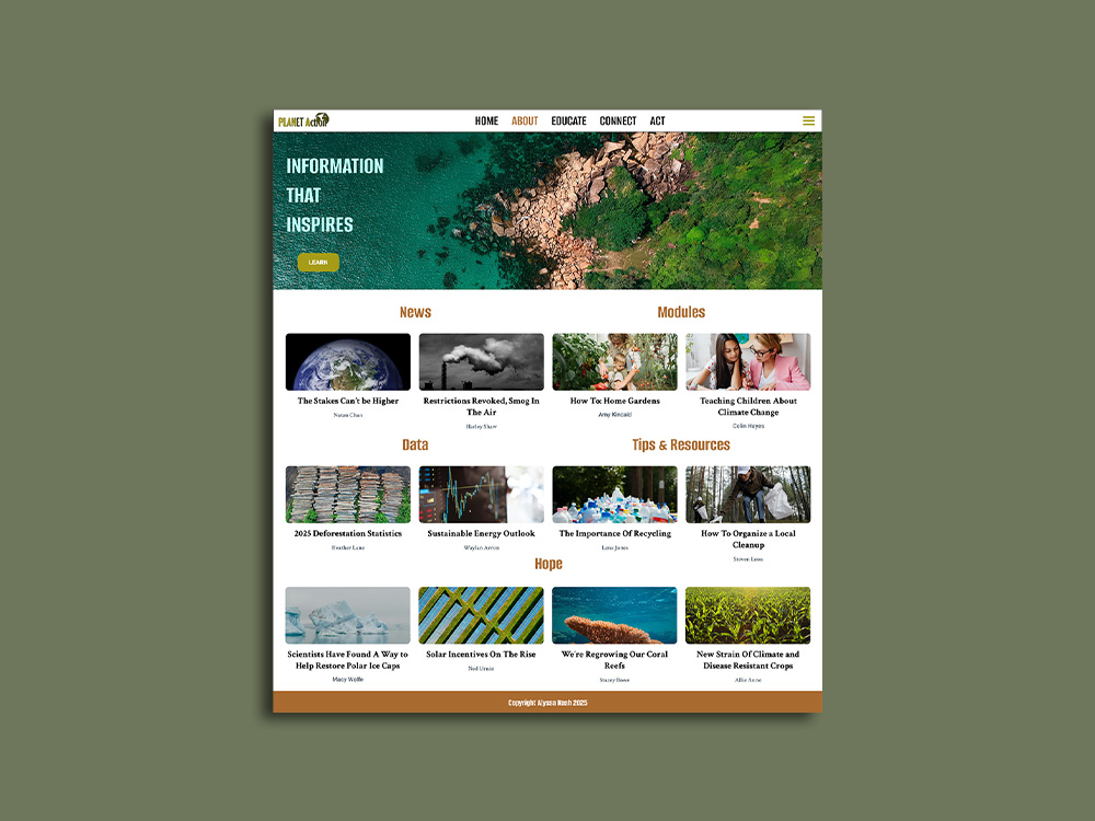
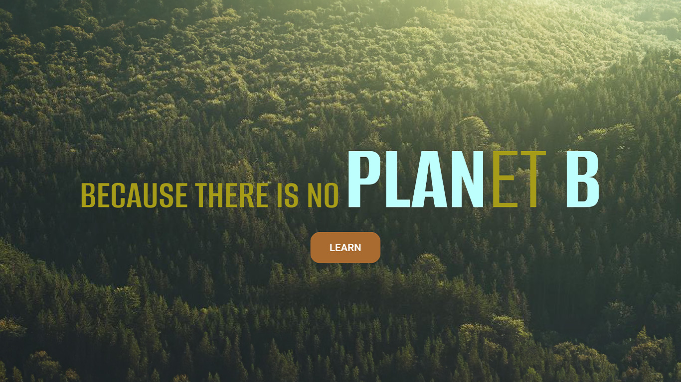
Planet Action is a purpose-driven website designed for an environmental organization focused on combating climate change through awareness, education, and community engagement.
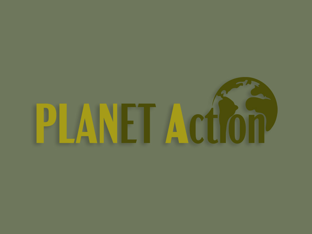
The logo emphasizes “Planet A” in bold to reinforce the slogan “No Planet B,” highlighting the urgency of protecting and valuing Earth as our only home. The platform brings together reliable information on climate change, ongoing scientific advancements, and practical ways individuals can take action, making complex topics more accessible and actionable for everyday users.
Alongside critical updates, the site also includes a dedicated “hope” section that highlights positive progress, innovations, and environmental wins, balancing urgency with optimism. Community features and connections to protest organizations further encourage collective action, giving users tools to stay informed, engaged, and involved in meaningful change.
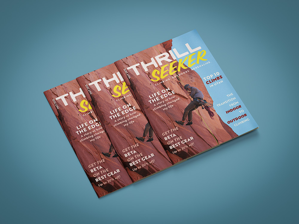
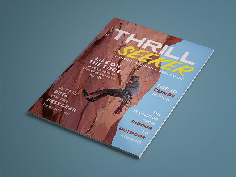
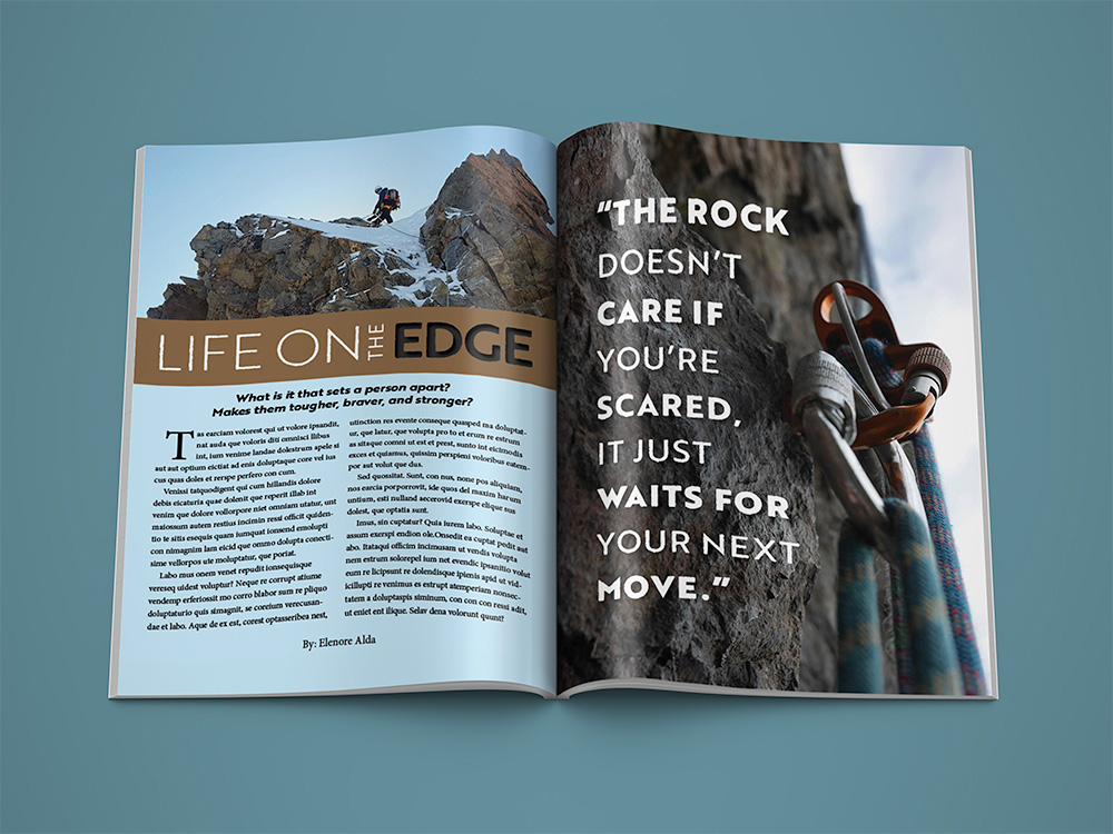
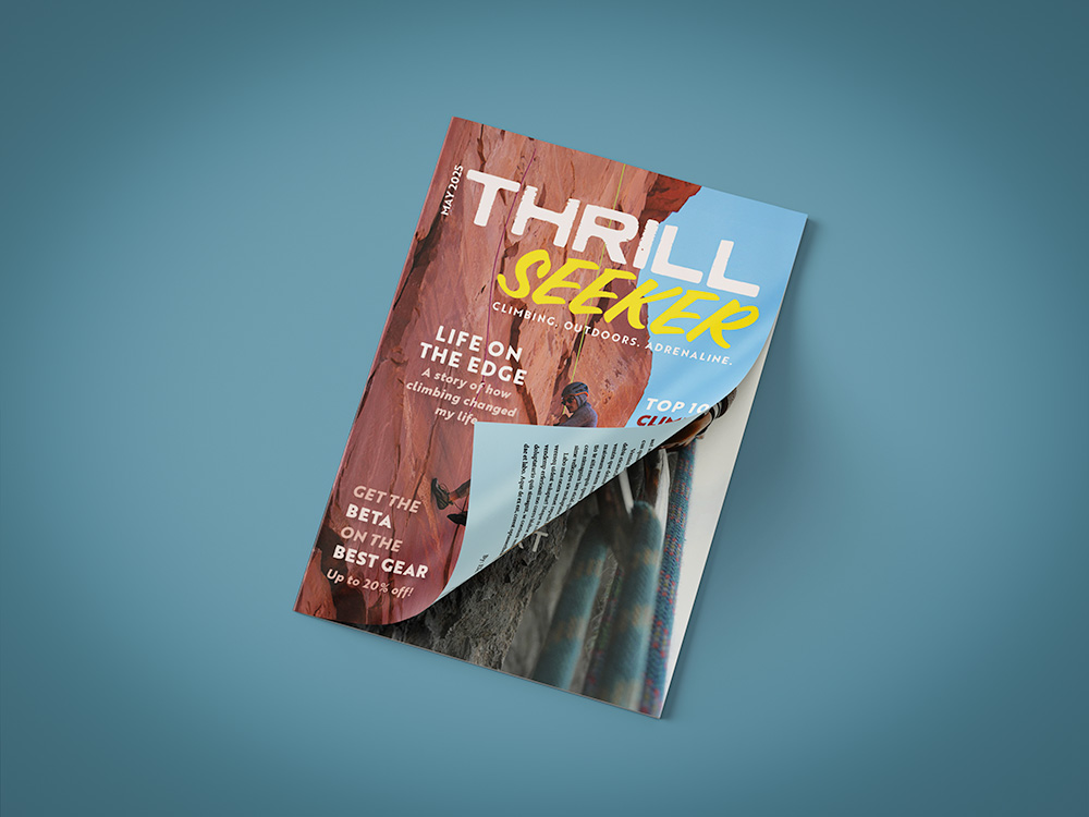
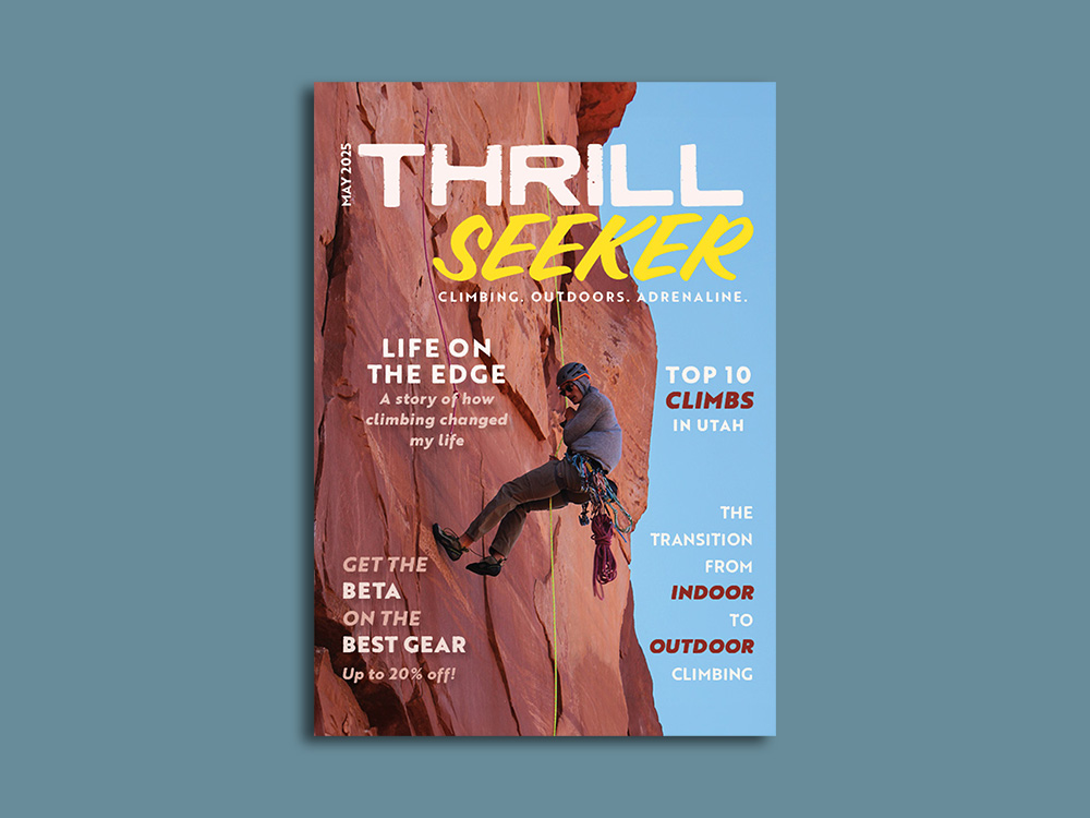
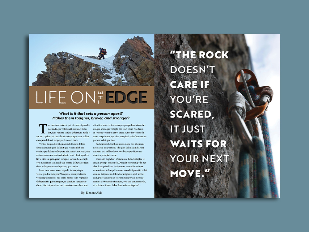
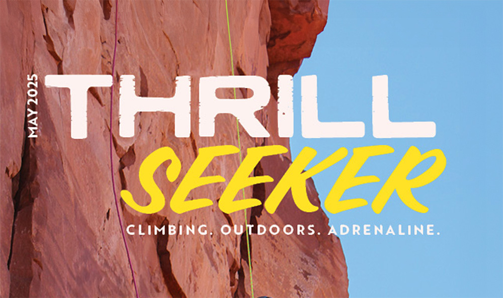
A two-part project for an outdoors magazine featuring striking, bold aesthetics across a cover and a cohesive two-page interior spread.
The cover features a photograph of a rock climber rappelling down the iconic Castleton Tower in Utah after a successful ascent, serving as a strong focal point that captures scale, movement, and achievement in the outdoors. Bold, adventurous typography reinforces the spirit of the publication, while the composition naturally draws the viewer’s eye to the climber at the center. This image is one of my strongest works, and it was especially rewarding to integrate my own photography into a graphic design context.
The interior spread continues this narrative with a structured editorial layout. The left page combines a feature story with an image and stylized title typography, while the right page presents a reflective quote over a full-bleed background image. Together, the pages create a balanced visual rhythm between storytelling and reflection, guiding the reader through the narrative while maintaining a cohesive, adventurous editorial style.
Branding
Branding
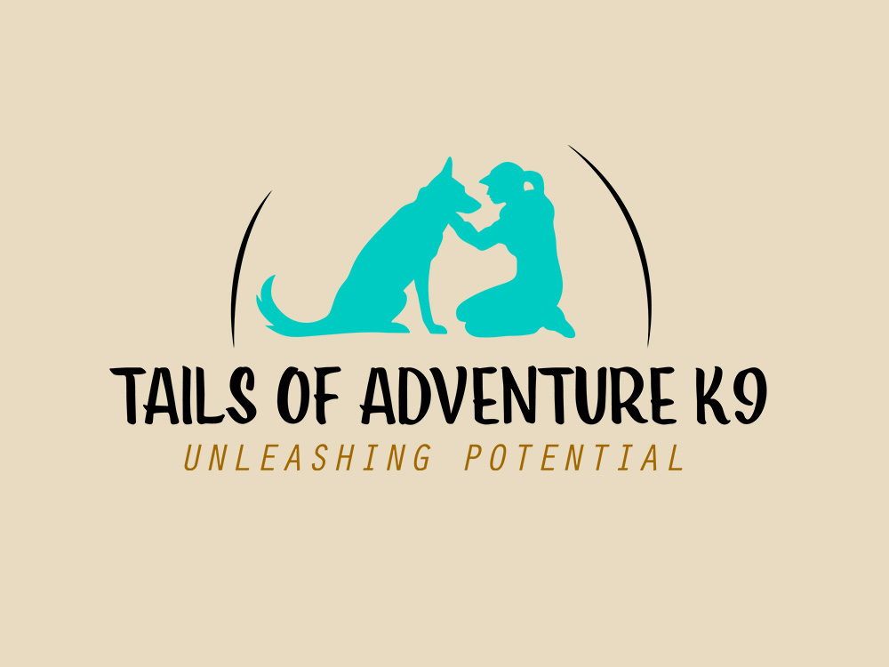
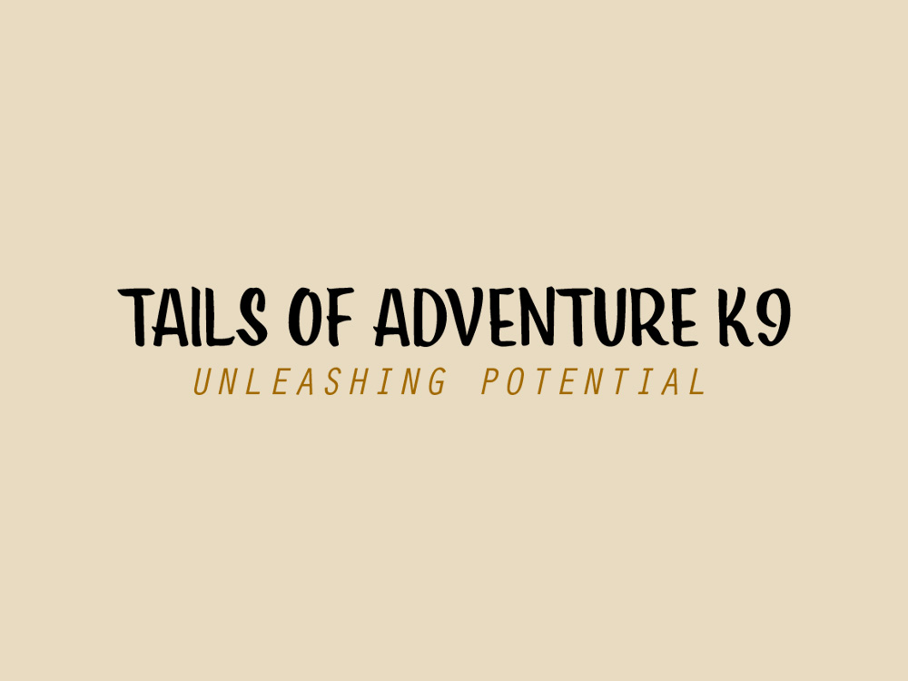
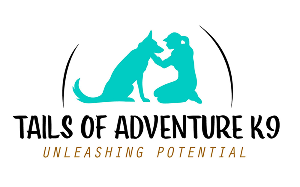
A logo for Tails of Adventure K9 centered on the bond between dog and handler, featuring a hand-illustrated silhouette that captures connection, trust, and growth.
The silhouette was drawn from a personal photograph of me and my own dog, giving the design a grounded, real-life foundation and a sense of authenticity in the relationship it represents. Subtle curved elements introduce a sense of movement and harmony, while the teal and brown color palette balances energy with reliability and warmth. The composition is designed to feel both dynamic and grounded, reflecting the active yet structured nature of dog training.
Together, these elements create a balanced, approachable identity that reflects the brand’s mission to strengthen relationships and “Unleash Potential.”
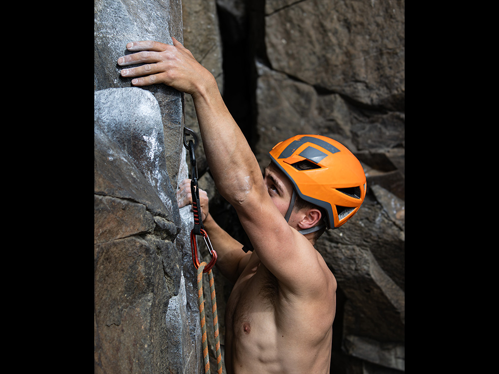
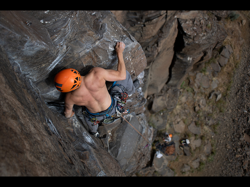
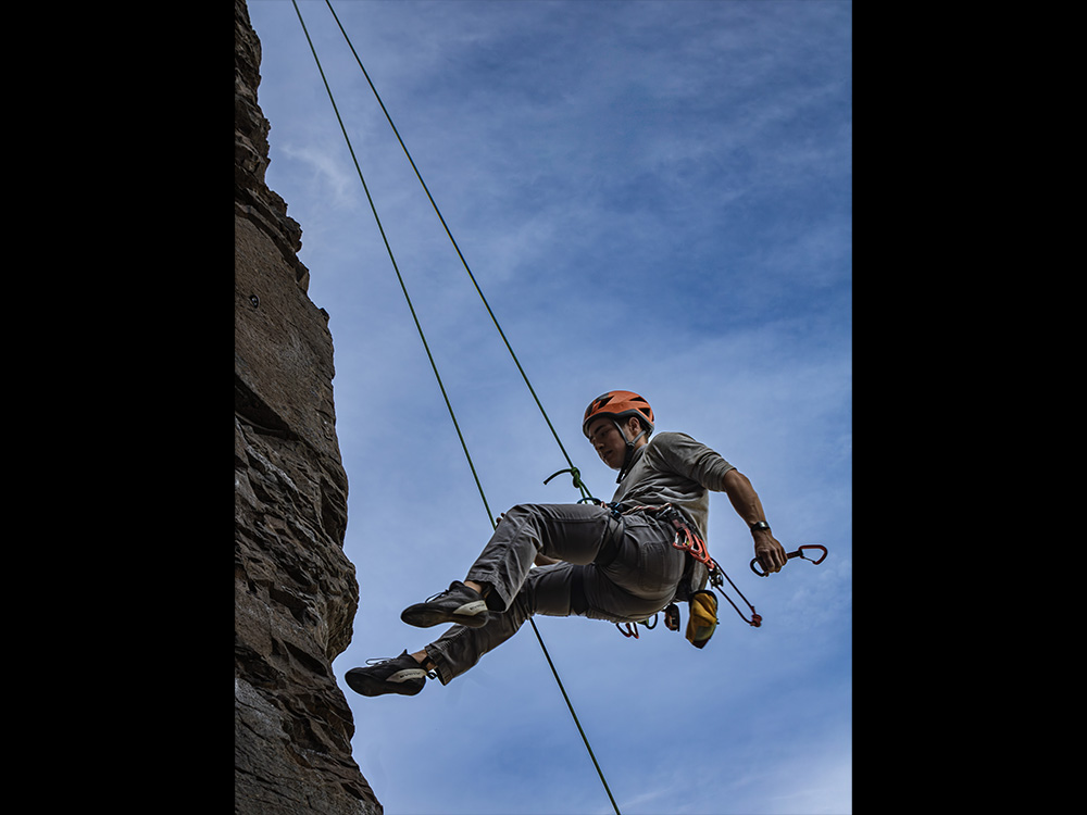
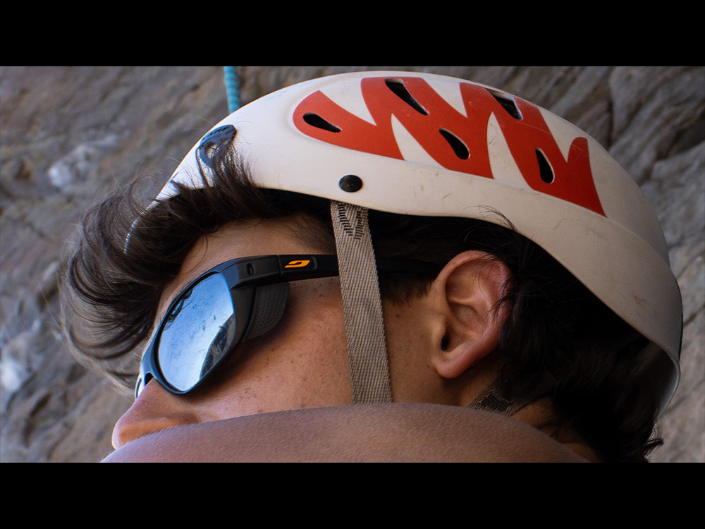
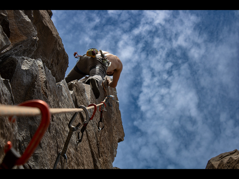
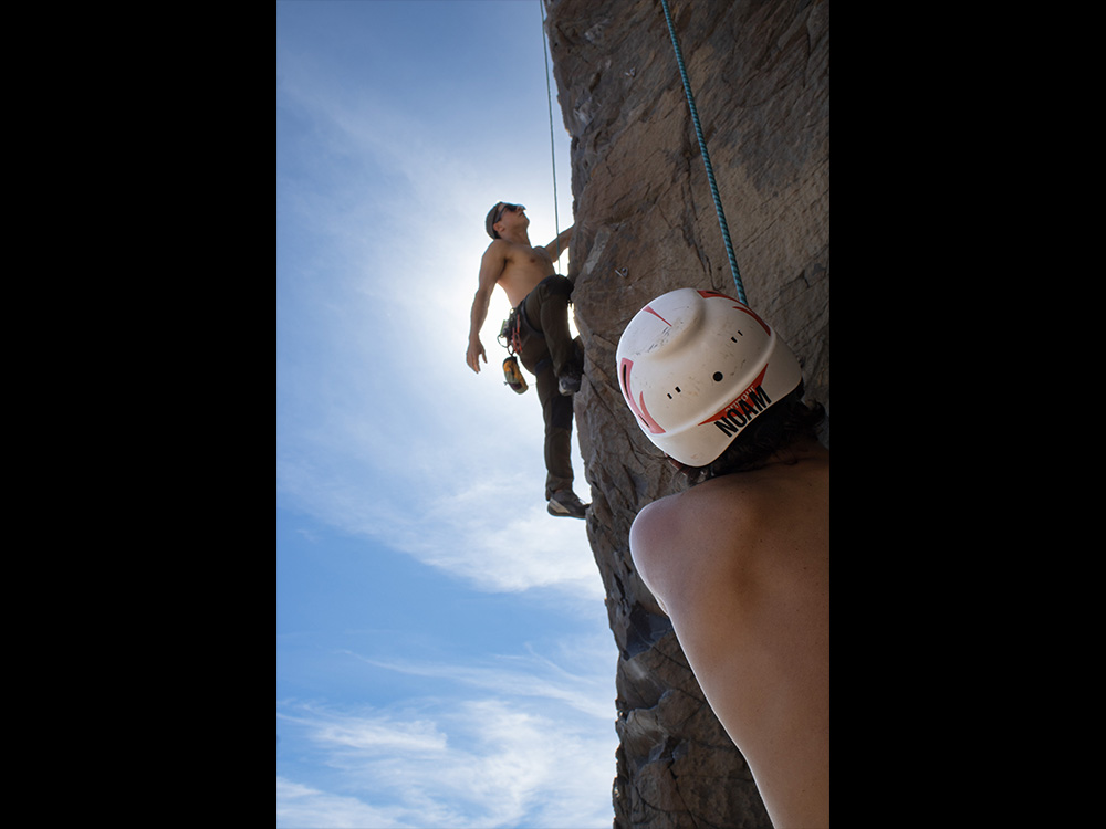
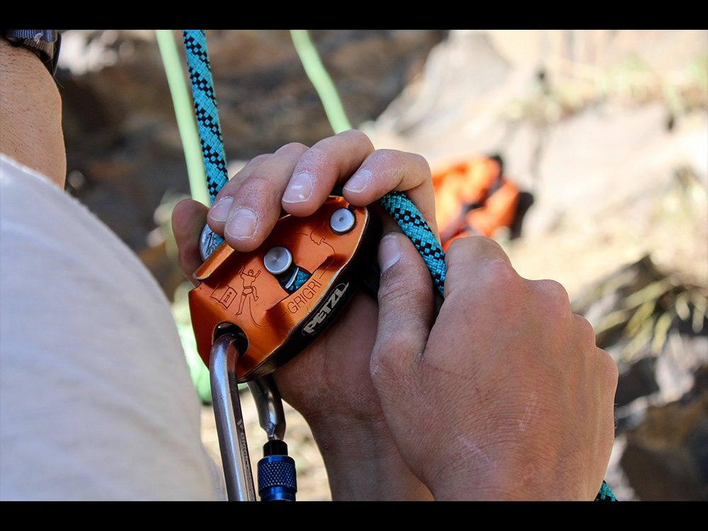
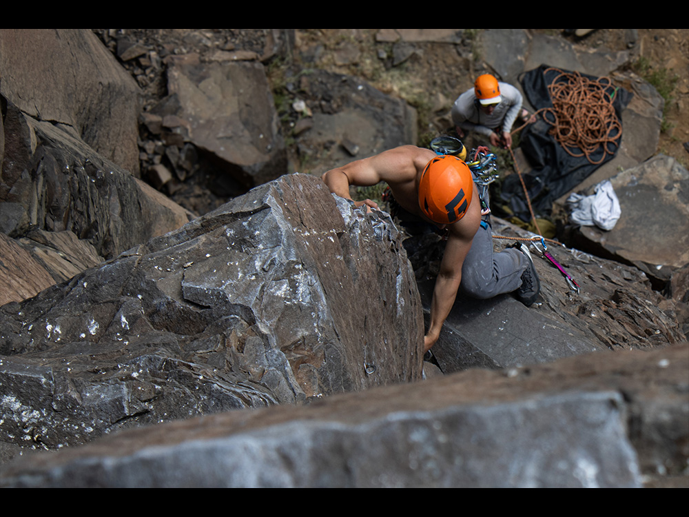
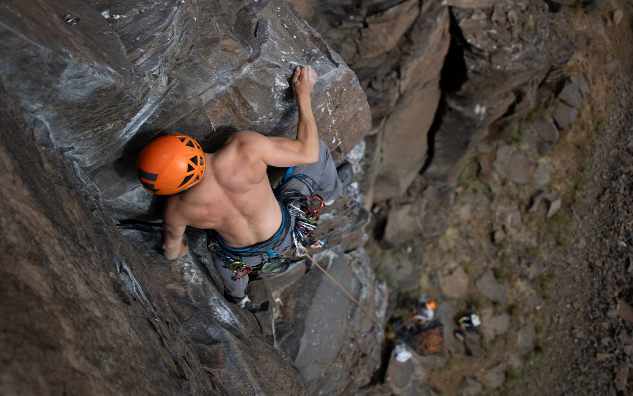
“Vantage Rock Climbing” is an immersive photography project that captures the intensity and raw beauty of outdoor climbing from a unique, on-the-wall perspective.
By working directly alongside climbers—rappelling and ascending the rock face—I’m able to document moments that are otherwise inaccessible, creating dynamic, high-impact imagery that places the viewer directly within the climb itself. This hands-on approach allows for a more intimate and authentic visual record of the sport, emphasizing both the physical scale of the environment and the precision required from the climber.
The project reveals not only the movement and environment of climbing, but also the trust, focus, and adrenaline that define the experience. It also highlights the relationship between photographer and subject in extreme outdoor conditions, where timing, positioning, and awareness are essential to capturing decisive moments. Together, these elements showcase the connection between climber and landscape in real time, reinforcing the energy and vulnerability present in the sport.
Photography